
After two decades of the age of beige, the interior design world is at last breaking out into a celebration of colour, writes Olenka Hamilton
A multi-coloured silken display beckons you into Luke Irwin’s shop on Pimlico Road, where he sells his unique rugs handmade in Kathmandu. His new collection, which celebrates colour, is made from recycled sari silk in hot pinks and golden yellows, blues, greens, reds and more; and because the rugs are made from recycled material there is randomness to them, which means flashes of unexpected colour appear in each. The effect is powerful and mood-lifting.
‘You’ll find people are drawn into the shop by something like this,’ says Irwin, looking proudly down at a fuchsia rug under his feet. ‘And they leave with something like this,’ he says, pointing forlornly to a grey one from a previous collection. ‘People are scared of colour, but in Britain we need colour because we live like little hobbits in darkness and drizzle.’

Pale Aqua interior at Design Centre Chelsea Harbour
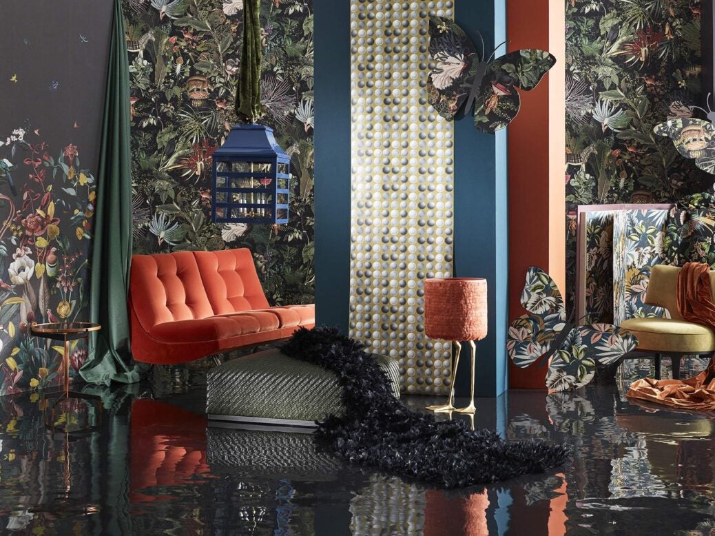
Irwin isn’t the only one who thinks we might be ready for a change. Just take a look around the Design Centre at Chelsea Harbour: McKinney is doing a range of curtain poles in coloured perspex; Flexform, known for its neutral fabrics, has on display a sofa in purple wool; and Artisans of Devizes is launching colourful tiles designed by artist Michael Angove. And never have the wacky designs of fabric and wallpaper designers Zoffany and Pierre Frey been so popular.
Related


‘We have found that people are much less scared of colour than they were two years ago,’ says Pierre Frey, grandson of the founder and his namesake, whose fabrics are famously eclectic and colourful, inspired by foreign travel, French 18th-century and contemporary art and nature. Frey’s latest collection is influenced by contemporary art, gardens and landscapes from the South of France, and he notes a rise in interest among 25- to 45-year-olds, whereas the company used to appeal much more to the over-50s.
Colefax and Fowler, famous for its signature ‘country house’ look, has never shied away from bold colour combinations, riding against the 20-year tide of taupe with its head held high. ‘I’ve had 20 years at Colefax, which started off in the world of colour followed by a 19-year blip in the world of muted tones and beige. There’s been a definite shift back,’ says Daniel Slowik, a lead interior decorator at Colefax. He notes that the more of a ‘full look’ an interior he posts on his Instagram page has, the more popular it is, and especially among younger followers.

Drawing room by Colefax & Fowler
An unabashed proponent of the colourful interior, who once delighted in building a room around an acid green rug, Slowik is thrilled. ‘I’ve always had this obsession with interiors which might be tasteless but aren’t,’ he says. ‘Clashing colours go really well together. If you study at the Inchbald [School of Design], they give you rules of what can and can’t go together – but there are no rules, you just need a trained eye, which comes through experience, not through a degree.’ What’s more, ‘It’s much easier to do a beige interior – you’re just not challenging yourself as much.’
There may be no rules, but there is a definite new trend not just for colour but also for the more sophisticated way it is being incorporated into people’s homes. Whereas two decades ago a whole room, from curtains to furniture to walls, might have been kitted out in a single print, today, notes Frey, ‘you might just do one wall for an accent of colour’.
Content from our partners


Slowik fondly recalls the years of ‘matchy-matchy rooms’ full of florals, ‘but you get bad derivative versions of it and it becomes naff’, he concedes, agreeing with Frey. ‘Today, I like the idea of a redacted version so, rather than being so completely surrounded by colour, it gives you a seizure, you pare it back.’ One example is a recent interior he did for a woman who wanted ‘quite a full look’. They did the linings of the curtains and the four-poster bed in a floral fabric, rather than the whole lot: ‘Quite sporadic but a fantastic effect,’ he says. Another project was Alexandra Tolstoy’s London house, which has had some media attention: while the walls and bigger pieces of furniture were kept neutral, flashes of colour came in very convincingly through the cushions, art and furniture coverings.
Few are more clued up on colour than ‘colour man’ Edward Bulmer, an art historian and interior decorator who produces a range of eponymous ecological paints made solely from 12 natural earth and mineral pigments. ‘I regard pigment as my grammar and colour as my vocabulary,’ he says, stressing the importance of tonality in colour for achieving a happy and harmonious interior, which can only be achieved through combining these natural pigments. Modern acrylic paints, on the other hand, are one-dimensional and so appear ‘lifeless or too dense’ in comparison.

Rust Portrait at Design Centre Chelsea Harbour
He compares the process of mixing paint to cooking: ‘a good helping of earth pigments’, such as red or yellow ochre, is like the salt, pepper and garlic you add to a dish to give it depth and harmony. For Bulmer, it doesn’t matter so much which colour you choose so long as you get the tonality right. ‘I have favourite colours, but I have found that the best colour is the colour that works,’ he explains. ‘Even if you can’t put your finger on it, we all have a sense of when there’s a discordant note – I can’t sing but I can still sense a discordant note.’ He notes that consumers are paying more and more attention, displaying improved knowledge, and placing more emphasis on quality over cost.
Someone who understood the power of colour was Diana Vreeland, who famously designed an all-red living room, known as ‘a garden in hell’, for her New York apartment. ‘All my life I’ve pursued the perfect red,’ she said. ‘I can never get painters to mix it for me. It’s exactly as if I’d said, “I want rococo with a spot of Gothic in it and a bit of Buddhist temple” – they have no idea what I’m talking about. About the best red is to copy the colour of a child’s cap in any Renaissance portrait.’ A room painted red, because the colour is associated with fire and therefore heat, supposedly encourages its occupants to drink more.
Fundamentally, though, ‘colour makes us jollier,’ says Slowik. The signature ‘country house’ Colefax and Fowler interiors, which prevailed in all their colours and patterns through the era of beige and minimalism in Europe, the US and beyond, are testament to this. And what’s for sure is that no one, except perhaps Kelly Hoppen, could become so fanatical about fawn as Vreeland became about red.

Luke Irwin’s bright and bold handmade rugs
Olenka Hamilton is staff writer at Spear’s